Okay fine, I guess no notifications for me then. Thanks.
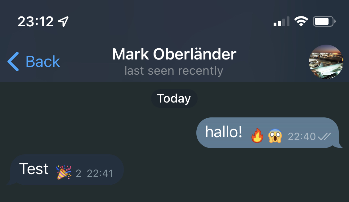
The new reactions in Telegram look even worse for me than what the grumpy website showed earlier. I guess it’s my color scheme (which is defined by Telegram, not something custom I cooked up myself, so that’s no excuse at all). In personal conversations the reactions are even less distinct from the message itself than in group chats.
I’ve long said that the easiest way for Apple to improve iMessage would be to pretty much copy the entire UX from Telegram. It’s pretty ironic that now Telegram chose to copy one of the absolute worst features of iMessage instead.
While Telegram’s selection of available reactions is a bit better and larger, it simply should not be limited at all. Let me react with every emoji I could also send as a message. The reactions available in iMessage are all some cringe Boomer stuff that I (and I’m almost a Boomer myself by now!) would only use ironically. Seriously, is there anyone on this planet who would use the “Haha” reaction in a non-sarcastic way and who does not have grandkids already? With my closest of friends I only started using iMessage reactions after we had a conversation about the fact that we all acknowledge their cringe, but ignore it and use the reactions anyway as they sometimes can be quite practical. But even with this shared understanding I’m still hesitant to use them at all. That’s how harmful this limitation to six (!) different reactions is.

New empty contact picture available!
Unsure why Messages insists on replacing an existing image with an empty one.
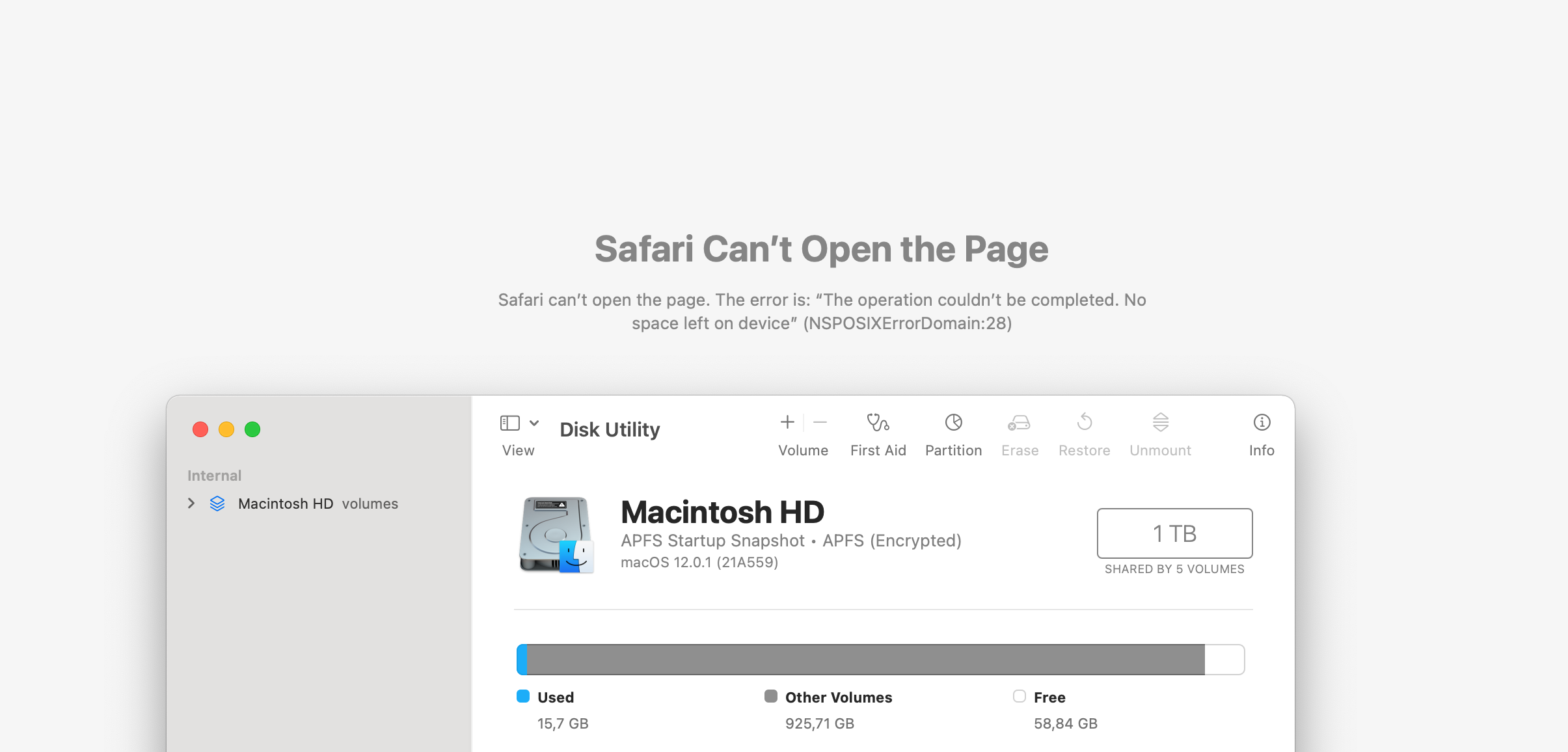
Not sure how much disk space Safari needs to open a website.
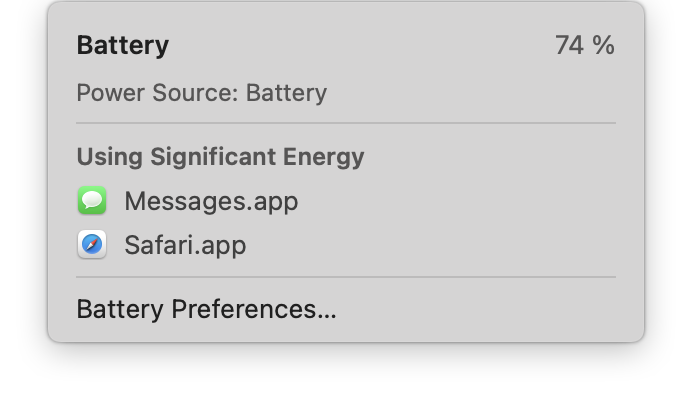
These damn Electron apps draining our battery!
Also running and actively being used:
- Slack
- Visual Studio Code
- Chrome
- 1Password
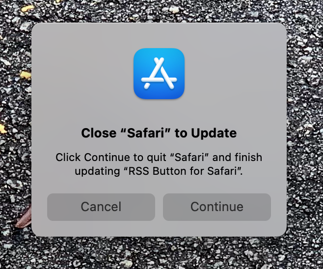
The only browser you have to restart to just update an extension.
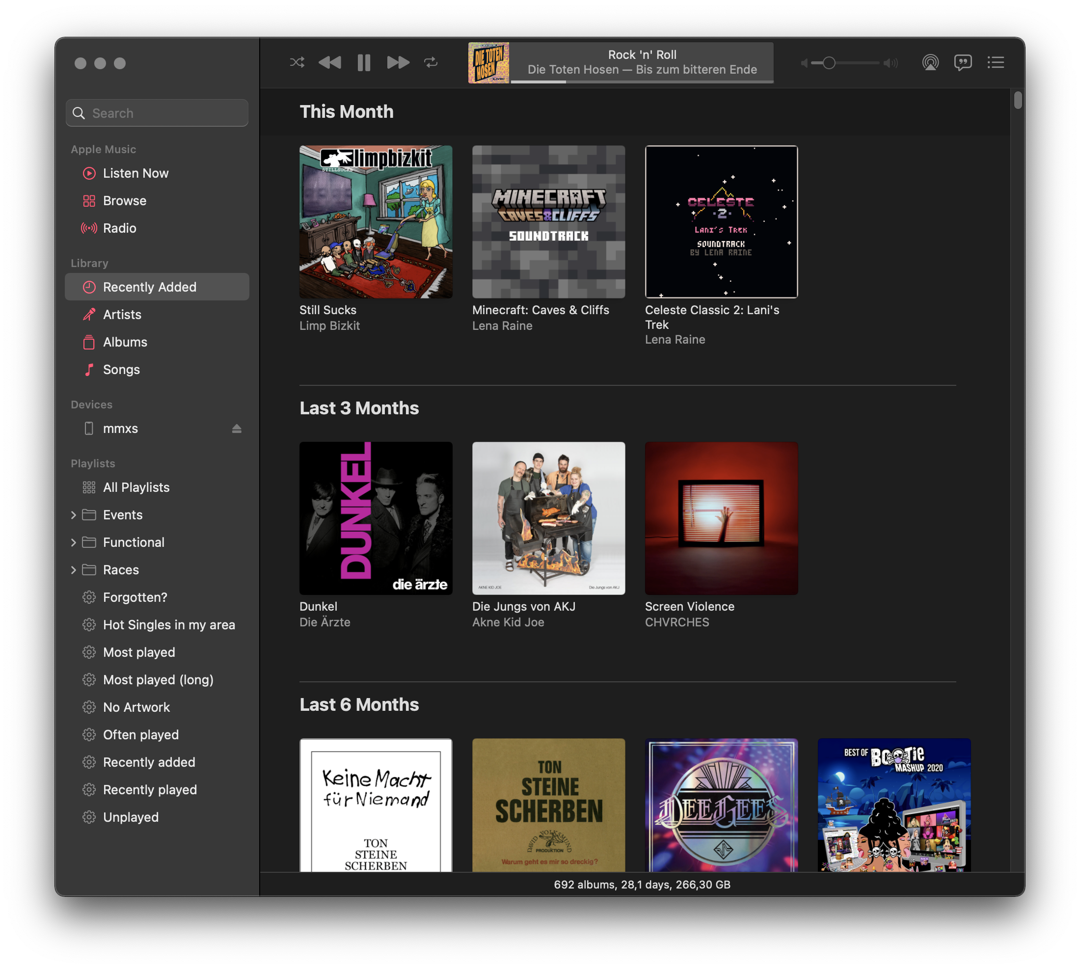
Looking for a specific song using the search function and then wanting that song to be played next seems like a fairly normal and common use case to me, but once again Music.app makes it seem like anything that’s not Apple Music was just left in there by accident. You can only right-click search results on the album art instead of the entire search result column, and neither “Play Next” nor “Play Later” are functional – consistently, also after restart and reboot. It works once you click “See All” in the upper right corner, but still only the album art is a right-click target in that view. Albums themselves can’t be right-clicked at all in search results, only opened by left clicking outside of the big play button they show on hovering (or the name). What a mess.
It may seem petty to be overly annoyed by the Apple Music ad in the upper left corner of Music.app in Monterey. I say ad because I’m not a Apple Music1 user, and it looks like there is no way to disable it. Let me know if I overlooked something, but I can’t find a way to get rid of it. When you first open the new Music.app preferences, it mentions that some stuff was moved to the “Screen Time” prefpane under “Content & Privacy” (the entire prefpane is just horrible, almost Windows preferences levels of chaos), but nothing about Apple Music is to be found there.
I’m even willing to give them the benefit of the doubt – maybe it’s a bug, maybe it was simply forgotten. I honestly don’t care anymore, it makes no practical difference if this particular instance is actually a forced shit experience to push their services down my throat or “just another bug” or carelessness. I’m tired. Tired of all the bugs, and tired of all the shit experiences for anyone not willing to pay a monthly fee. Not that the experience is much better if you do pay, as documented way too often in previous posts.
This decline in software quality and user experience has now gone on for so long that we’ve almost grown numb to it. When I complained about this to Philipp privately, his initial reaction was “Just subscribe and be happy”, and he was only partly joking. I have the same reaction to similar things sometimes, most recently when a friend shared his multiple day horror story of trying to get a Minecraft account unbanned after it was (probably, because usually you can only guess what the algorithm has decided today) flagged for the heinous act of not having a phone number in the connected Microsoft account. “Just add the damn phone number” I thought, because I have personally long given up the fight to not have to share my phone number with everything I use. He was of course right how utterly unacceptable his experience was, not even being given a way to contact support after being locked out of something he paid for. But we’re all so damn tired that sometimes it feels better to “just give in” and stop fighting.
-
Here’s a “fun” story about the person who built up that service, go figure. ↩︎
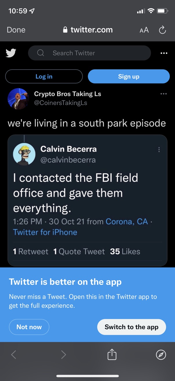
Is it unreasonable to expect seeing this very tweet in the app after tapping “Switch to the app”? For me, this opens the app and shows my Home timeline, every god damn time. It even says “Open this in the Twitter app” right there, surely this can’t be the magical “full experience” they mention.
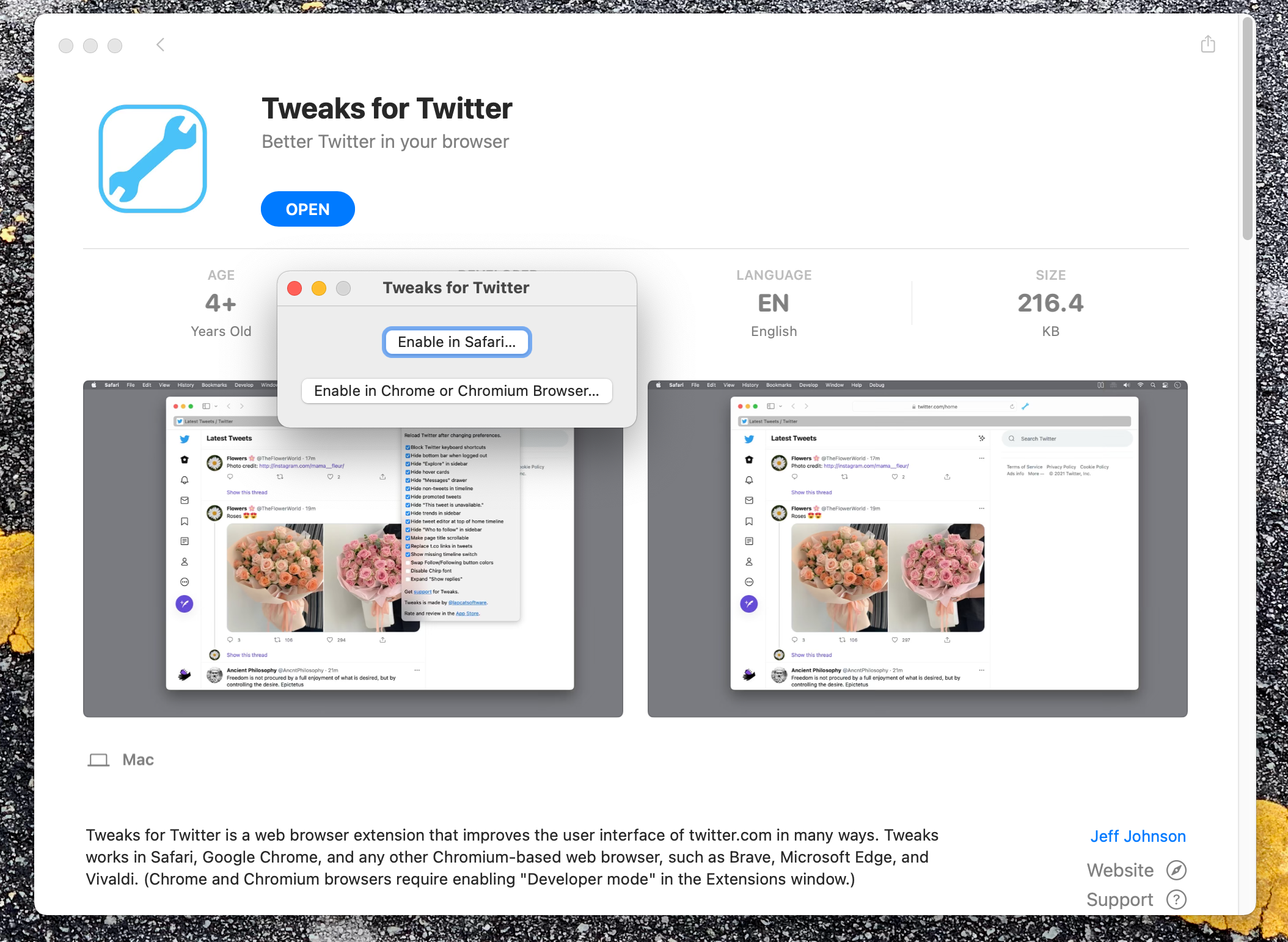
I’m happy that Safari extensions are becoming more popular again but if Steve would see the workflow of installing an extension these days some people would be shown the door.
- Install “app” from AppStore
- Open app that is sometimes just one button
- Safari Preference window opens
- Enable extension in that window
- Find small button to configure options of installed extension
- Click on small “warning” sign on the extension icon in the menu bar to grant permissions to the extension to read the current website