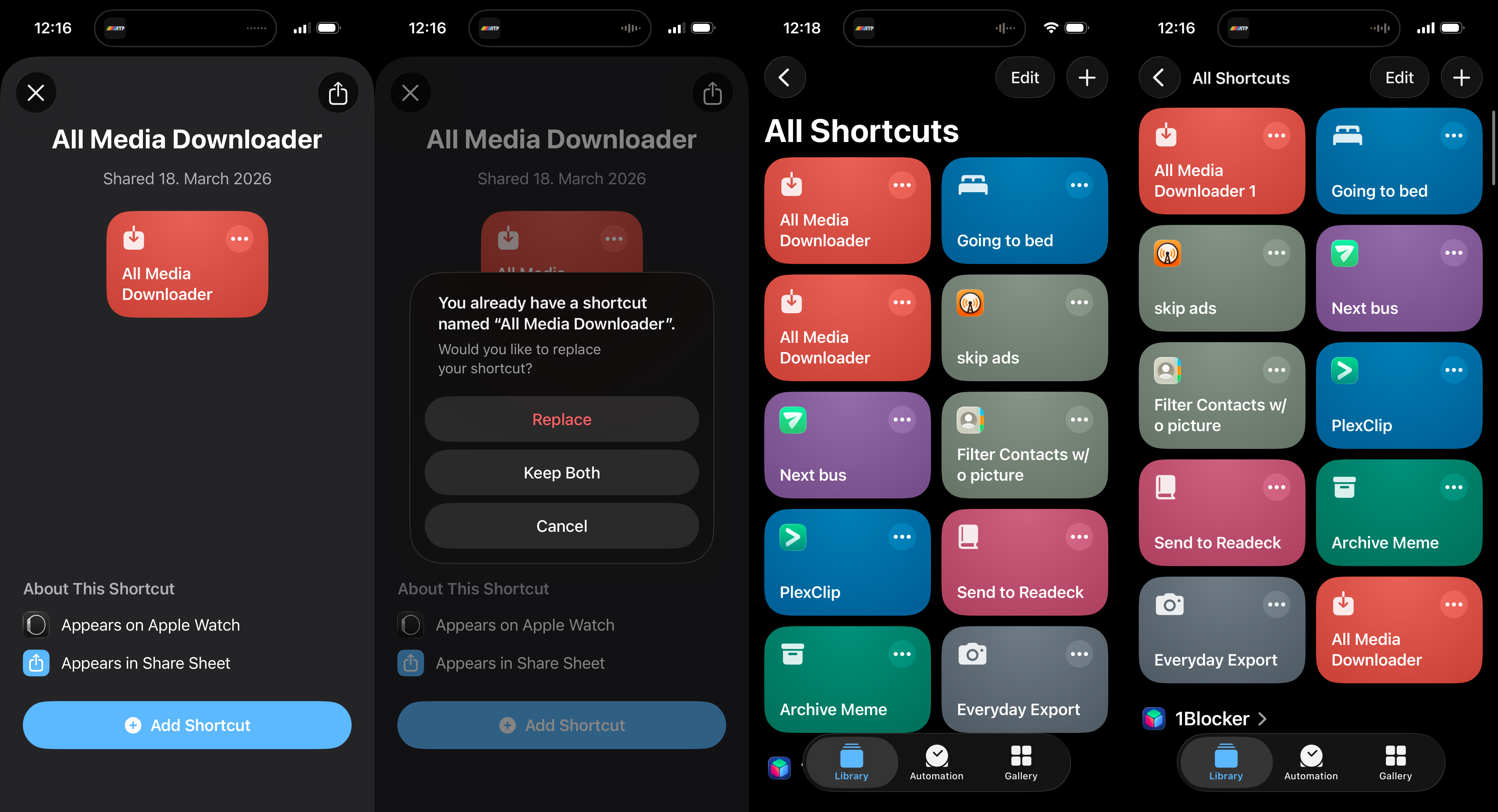
It’s almost impressive what a miserable, useless piece of crap the Shortcuts app remains. First off: No actual concept of versioning or upgrades for shared shortcuts. Sharing shortcuts happens via weird iCloud URLs rather than being an actual aspect of the system. So to update a shortcut, do you just add it again? No indication of what that will do before you press the button. Will it error out? Will it create a duplicate? Will it update/replace the existing one?
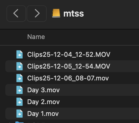
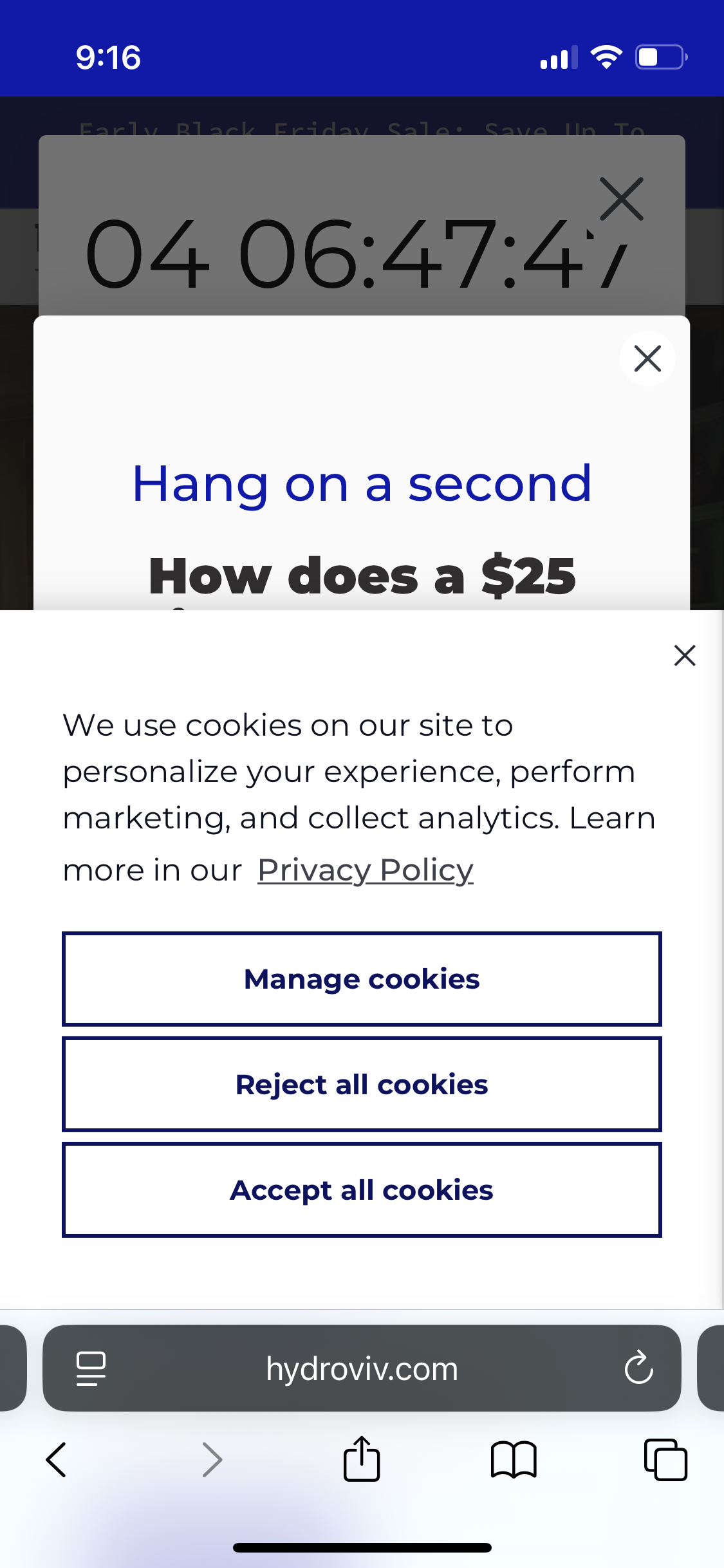
Alright, just risk it – now iOS does offer reasonable choices. Take a wild guess what I picked in the second screenshot to end up with screenshot #3 – yes, of course I chose Replace and it kept both regardless. Not just that, for some weird reason it created two with the exact same name. Which one is newer? Of course this Playmobil-ass UI doesn’t show anything that would be remotely useful for serious people. Imagine wanting to sort your shortcuts by date or see the last modification date, like some rocket scientist. Well, not on this consumption device that costs more than a used car.
One of the duplicates was still able to run – the original I presume, because the workflow itself has implemented an update check and still told me there’s a newer version. The other one showed some cryptic error that I was too lazy to screenshot, and afterwards the state was screenshot #4: now they’re named differently. And for some reason sorted differently as well. But they still behave the same: One outdated, one broken.
I deleted the new one (with 1 at the end) and retried the process a few times – same result, it always created a broken duplicate of the existing shortcut despite picking Replace.