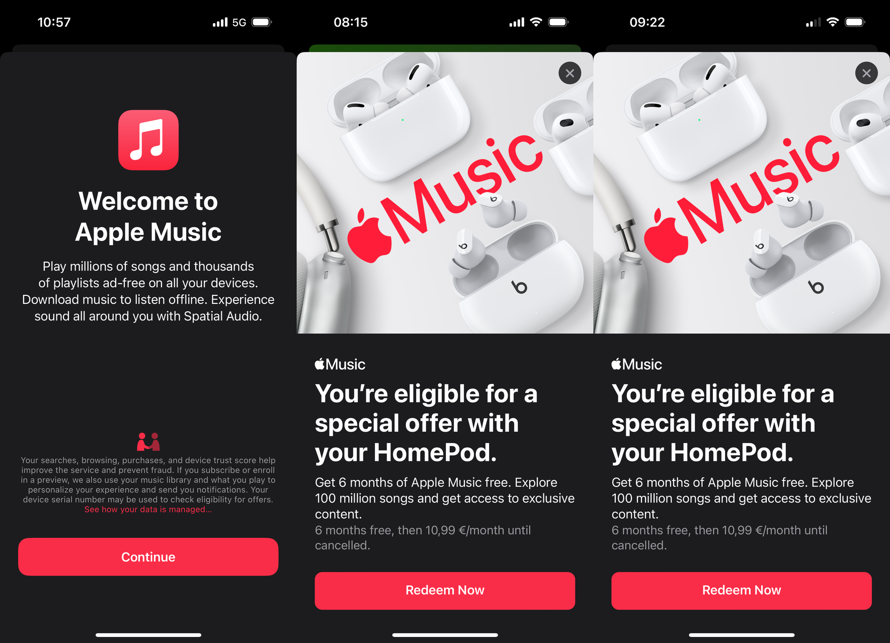
Follow via RSS, Twitter, Mastodon, Telegram or email.

So many questions… for example: Why show this instead of restarting automatically, it’s not like I’ve got a choice.

Up until a few years ago, I used to feel good when sharing Twitter links. Compared to the other handful of websites that now make up our entire lives, it was the best option:

  • Not a walled garden like Facebook or Instagram where you either don’t see any content at all or are bombarded with “sign up to continue” popups after scrolling down more than ten pixels.
  • Not horribly confusing and overwhelming for people that don’t use it regularly like Reddit, be it the old or the bad design.
  • Mostly clean and straightforward links.

None of that is true anymore. As a user that isn’t logged in you’re now bombarded with the same engagement nonsense as anywhere else.

Even if logged in, they’re so desperate for increasing engagement that UI clarity suffers, for example when “Related Tweets” will be shown in a way that makes them look like they belong to a thread.

And since a few weeks (for me, seems to be rolled out in stages) there’s some weird, random new tracking parameter when sharing links to tweets. Now I have to make an effort to share clean links, or rely on additional tools that automatically remove tracking garbage from URLs in my clipboard.

As a year-long Twitter user who’s always logged in on all devices, I didn’t really consciously notice how things deteriorated over time. But thanks to the fresh hell that every damn iOS app has its own integrated “browser”1, even despite already having an account I now often see what Twitter unleashes on people not willing to succumb to their pleas for signing up.


  1. Sometimes that is actually preferable, but I still think that overall it’s quite the indictment on how much iOS still sucks for multitasking that just opening a link is so much more cumbersome and interrupting than it is on a desktop. It’s ridiculous how many high-profile apps have a dedicated setting for where you want links to open. Some (Apollo, a great app!) even have specific options for links to specific sites. ↩︎

Justus writes: “For months now my 2014 MacBook Pro has been nagging me to upgrade to MacOS Monterey. And I would love to…except my laptop is older than Monterey supports!”

Thanks Justus for the submission!

If you have AirTags in the vicinity of your iPad it drains its battery for no reason.

The past months I’ve been wondering why my iPad Pro always needed to be recharged when I used to use it without charging for weeks.

I’m not the only one:

Literally the only helpful piece of information for me here would be the exact starting time in my current local timezone, because depending on when exactly DST starts in each country it might be an hour sooner or later.

While I do have all my devices set to English, I of course also have correctly specified where I live, so this should be about the easiest thing in the world to provide.

Instead, Siri demonstrates that not only is it unable to give that information, apparently it doesn’t even know what timezones are at all. Also it seems like I’m pronouncing “GMT” as badly as “30 minutes”.

I also recorded the attempt of getting any useful information out of my HomePod, and playing back that recording on my iPhone managed to trigger Siri on that same device. I feel like I’m taking crazy pills, because things like that were already working quite well years ago. What the heck did they do to make Siri so much worse?

Now if only there would be space to add useful options. Maybe the main functionality of the app: “turn light on/off”?

Someone’s getting paid by app openings.

Bonus points for the pixelated app icon in 2022. It’s only been 10 years since the introduction of retina screens on Macs though.