Follow via RSS, Mastodon, Telegram or email.

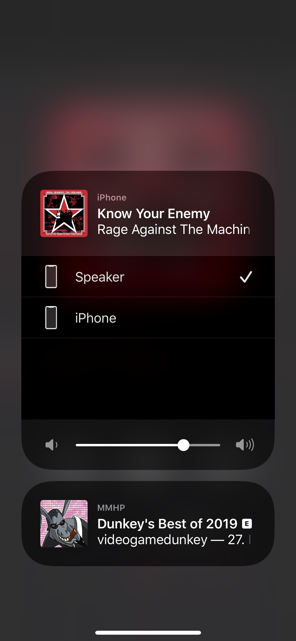
This is the list of upcoming tracks in the Music.app of iOS 13. Neither of the two songs listed twice is actually in the list twice. Upon playing one entry, the other one disappears. Roughly guessed about 5% of all tracks shown in this “Up Next” list are such duplicates for me. But that’s not the only thing wrong with that list.

First, something that’s also visible in this particular screenshot. Or rather, it is not visible. Because normally there is a header above the list that tells you whether you’re currently in the “Up Next” section or in the “History” section:

image

I have no idea why that is not there in the first screenshot. Sometimes it’s just not there. I can’t reproduce it, but when it’s happening, it is quite annoying indeed, because as you can see, the controls for Shuffle and Repeat are hidden there. Apparently there was no more space for those in the actual “Now Playing” screen. (Dare I mention the lock screen widget is also missing those controls, where literally twice as much screen estate as the widget uses would be available.)

Next, you can also edit the order of upcoming tracks. For example you might want to drag a song that’s coming up later to the very top, so it starts playing right after the current song. But as I said, when you scroll up from the “Up next” list, it transitions to the “History” list. Even when you’re currently dragging an “Up next” item. Of course you can’t drop the item in there, because that would make no sense at all. You have to see it to believe it – try it out, and be amazed by how the “History” header drops into the list when you drag your finger far enough to the top of the list while it scrolls (this happens with “Up next” as well).

And the thing that’s driving me absolutely insane is how ridiculously long it takes to disable/enable Shuffle. My use case is as follows: Before hopping into the shower, I check if the next few songs are cool. If they are not, I disable and re-enable Shuffle to get a new variation of songs. Repeat until satisfied, then shower. I do this daily, and I’ve been doing it for many, many years. When I started doing it, it happened as fast as my fingers could double tap the Shuffle control. It was basically instantaneous, there was no visible or percebtible delay. Since at least iOS 11 it takes about a second to switch from one state to the other. One second! To reshuffle a fucking list. I find it hard to come up with adequate words to describe how bad you fucked up as a tech company when you need a full second to shuffle a list.

I’m using QuickTime multiple times per day to record something I want to share. I always use the included “New Screen Recording” feature for that.

And every time I open it I’m greeted by the Finder’s file picker asking me to select a file to open. This dialog is presented dead in the middle of my screen. Usually in the exact same spot where I’d like to record something.

The workflow is:

  1. Open QuickTime
  2. Click “Cancel” on file picker dialog or move it to the side
  3. Select “New Screen Recording”

The new tab placement “logic” of Safari is driving me insane. In this video all I did was click to switch/close tabs and press ⌘T to open new tabs.

Step by step in this video this is what happens:

  • Tab 1, new tab right of tab 1 (next to it)
  • Tab 5, new tab right of tab 6 (end of bar)
  • Tab 2, new tab right of tab 6 (end of bar)
  • Tab 3, new tab right of tab 3 (next to it)
  • Tab 2, new tab right of tab 2 (next to it)
  • Tab 5, new tab right of tab 5 (next to it)
  • Tab 6, new tab right of tab 6 (end of bar, next to it)
  • Tab 5, new tab right of tab 6 (end of bar)

Safari, you’re drunk.

For a while now I haven’t been getting email notifications at work when someone cancels a meeting. So today I finally went to check if I had changed a setting without remembering, but I guess someone at Google just fell asleep on their keyboard while editing my settings row in their database?!

New Podcast.app on Catalina behaves very weirdly. The sidebar randomly either highlights the clicked on selection or it doesn’t, no pattern.

On iOS it seems potentially useful to have app “suggestions” (some things are just easier to handle in a dedicated app than in a mobile browser) it doesn’t really make sense in Safari on macOS.

While other annoying features like websites offering push notifications have a “Don’t ask me again” button, there’s no such thing here. Uninstalling the app seems to be the most reasonable option.

Yes, Google. This is exactly what I had in mind when I clicked the “Insert chart” button. The underlying data could not be more simple and linear, but of course I wanted this satanic symbol and not just a boring graph.