Follow via RSS, Twitter, Mastodon, Telegram or email.

This message is a lie.

In order to help a coworker restoring their Macbook, I was preparing a bootable USB medium according to the official (and frankly excellent) documentation from Apple. Step one is downloading the OS you want to install, in this case 10.15, so you get Install macOS Catalina.app. This process alone is pretty wild on Big Sur, now that they moved back from using the App Store for OS updates: In the support document all old versions back to High Sierra are linked – to the Mac App Store. I was not able to find those pages via App Store search, however. Not sure if that’s intentional or just the bad search.

So I clicked the “GET” button on Catalina’s App Store page. Which redirects into System Preferences, and then proceeds to download the file there. It is still put into /Applications as expected, but seeing that redirect out of the App Store is wild. After a successful download, System Preferences jumps in your Dock to alert you about an error: This installer is too old to be run on my OS version. No shit, sherlock? Luckily it does not instantly delete the file upon confirming that error, so I could proceed with the instructions.

After successfully (and easily, to give credit where it is due) creating the bootable USB medium from the downloaded installer, I wanted to get rid of it, as it weighs over 8GB. I could move it to the Trash after confirming with my admin account – to be expected for things that the App Store put into /Applications. When emptying the Trash, though, this error message pictured above came up.

Well, it did just start the installer right away after downloading it, so maybe some files are still in use? Good thing I need to reboot for the 11.2.1 update anyway. But alas, even after rebooting, the file refused to be deleted, same error message. I confirmed that the file was very much not in use using lsof.1

I tried a few things, and went researching on the internet – apparently that problem is rather old, but never seems to have been fixed, just a few results:

The solutions that (should, I haven’t had time to actually test it myself) work are either disabling SIP or rebooting into Recovery Mode and mounting the disk there. I did nothing uncommon, nor is my setup in any way responsible for this. This hits normal people who simply follow official Apple instructions. 8GB wasted, which you won’t be able to reclaim without a significant investment of time, and nerves – if you’re not too comfortable with these kinds of things. For many people that is a lot of disk space, because Apple is still pricing their internal storage like it’s made of Fabergé egg shells. Once again I wish macOS wasn’t free, so I could at least request a refund for all the time I have to waste debugging it.


  1. I have to admit: I’m not 100% sure this is reliable on modern macOS, which feels like a sad judgement about the state of affairs on macOS in itself. ↩︎

Don’t you just love it when your computer tells you to do something and then prevents you from doing it? Especially when it tells you to manually save your work because it can’t do so automatically (message on top), but a split second later shoves an error in your face that makes it impossible for you to actually do that? Gotta love webapps.

Thanks Fuchen for the screenshot!

Imagine what we could achieve if we had machines that were powerful enough to split text on their own.

And yes, if they did it automatically, I’d certainly complain about how Google Messaging ’21 is doing a horrible job at splitting my messages, ripping apart sentences and what not. And rightfully so, because… why even have this limit in the first place? 4096 characters isn’t exactly a lot, especially when it’s in the context of a “dump anything you want in here” thing, where I can also casually drop in a 50GB video file and have it magically be put into my Google Drive and sent as a link. Shouldn’t a messaging app be good at actual messaging?

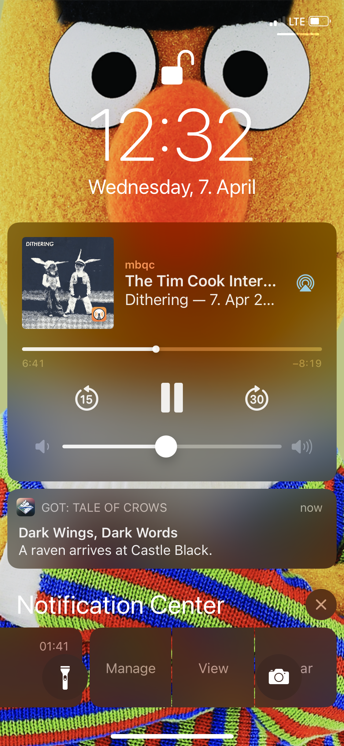
  • Left: Alarm, with the “Stop” button at the bottom.
  • Right: Timer, with the “Stop” button at the top.

I could never quite put my finger on why I always felt a bit insecure on either of those screens. Nothing terrible happens when you hit the “wrong” button, but it was odd to me that I never was confident on where to press. Today I realized the reason – these almost identical screens have the functionality switched around. Why?!

In most cases this works amazingly well, except when it doesn’t.

Recently I wanted to try this new app that promises to match1 you up with people who play the same games as you, on the same system(s) as you, and ideally on a similar skill level as you.

The screenshot on the left is the final step in their onboarding, forcing you to start a (free) trial that would auto-renew at €17.99/month (!) after a week. There is absolutely no way to skip this step. It comes after you already invested a significant amount of time creating your profile, which includes connecting your various platforms via OAuth and other painfully annoying steps.

As I don’t want to support these kinds of predatory scams, I decided to not use the app. But the way their onboarding works of course also means that they now already have my data, and access to any kind of delete/revoke features are hidden behind this subscription-wall.

So I accepted the free trial, instantly canceled it (which really is commendably easy on the App Store) and went back to the app to delete my account. I was then greeted by the right screenshot.

Maybe this kind of onboarding that forces a trial on you is okay by the App Store guidelines. I don’t know. Sure, the trial is free, and it is fairly simple to cancel. I don’t care. The app mainly targets kids, and this disgusting behavior should not be allowed on the App Store. I’d love to hear them explain how this is better for the customer than the unimaginable horrors of someone who isn’t a Hey customer accidentally downloading the Hey app. It could not possibly have anything to do with the fact that one of the two things is bringing in more services revenue, could it?

Or maybe it’s actually against the guidelines anyway, but the amazing App Store review process didn’t catch it. I don’t even know which possibility I’d find more depressing.


  1. Just so you can suck at Rocket League together, not for for dating. Although my brief glance inside the app sure made it look as if – much like dating apps – it’s also very much a funnel for OnlyFans accounts. ↩︎

That is a pretty picture! It’s by Mika Baumeister, whom you should totally check out – ton’s of amazing photographs. Now here’s a little quiz, which of the following two statements describes the image better?

  • “silver imac on brown wooden table”
  • “Ten iPads charging up. They are used for eLearning.”

What a silly question, obviously one of them is some ML-generated SEO garbage, and the other one is the actual description, provided by the very human being who uploaded the picture. You will never guess which one Unsplash decided to use as the alt text of the image!

To be fair, their auto-generated descriptions are often pretty good. And users probably sometimes don’t give a description. But why prefer the unreliable ML content to the human content when it is available?

Thanks Fuchen for the hint.

I almost had a heart attack when I saw those checkboxes, because a minute earlier I had already submitted the same form for another item – without paying the checkboxes any attention, as they had always been unchecked by default. Checking them without good reason can result in a metric ton of useless busywork, I was absolutely horrified.

Luckily, the checkboxes in the screenshot above are not checked. This is what they look like when they are checked:

Check mate.

Don’t fucking do that. Just don’t style default controls. (Of course they aren’t even actual checkboxes but styled <div>s.)