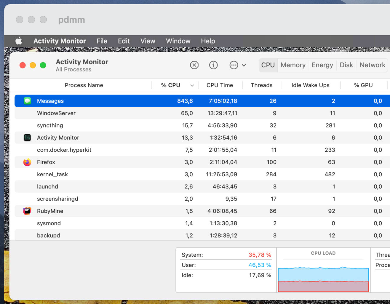
Follow via RSS, Mastodon, Telegram or email.

I’ll admit it, I’m really fast with computers. It is quite possible that less than a second goes by between when I open Plex and when I hit the Play button. Quite possibly not enough time for some Javascript and new assets to finish loading before finally triggering that popup. But come on, Plex. You’re supposed to be one of the good ones. Don’t do me dirty like that, interrupting me after playback had already started for several seconds(!), while I’m just trying to relax and watch some Scrubs with the original soundtrack from the DVDs.

I’m sorry, what? I have so many questions about this. Why can’t it be installed while audio is playing? How was it decided that disabling the button and showing this notice – without any explanation at all – is better than just… stopping the audio when updating, which requires a reboot anyway? What dark magic did earlier updates contain to allow such marvels of technology as… simultaneous decoding of audio streams and downloading of update data?!

I was bitching to Philipp about how this is still a thing due to my IntelliJ IDE being updated. When I opened the “Notifications” screen to allow yet another “java” entry to notify me of things, I was confused by the “Allow Notifications” toggle looking inactive. Admittedly that confusion is partly my fault, because I’ve set my “Accent Color” to “Graphite”.

Something still felt off, though. It took me a few seconds, but then I realized what threw me off: “Banners” is highlighted in a gigantic blob of bright blue. So subconsciously I was getting mixed signals from that screen about how color is used to differentiate things.

Check out the “General” screen with “Blue” versus “Graphite”:

General settings with “Blue” accent color

General settings with “Graphite” accent color

If one of the radio selections in the second screenshot was blue instead of grey, I’d probably also assume that the other ones were inactive. Why is “Banners” in the “Notifications” screen not highlighted with the correct accent color?

The Apple Arcade1 exclusive, “Game of Thrones”-licensed blockbuster mobile game Tale of Crows has a fun mini-game in its settings screen called “Can you spot the close button?”. (It’s an x on the top right, in case you can’t tell.)

Left screenshot is when you normally enter the settings screen when using the game. The one on the right is when you enter back into the game after a while and it has to reload from memory, I suppose. In both cases it takes a few seconds before the Game Center2 banner animation is done and you can safely tap back out. If you try your luck and miss the target, you can spend another few seconds waiting for Game Center to load and then try your luck getting back out there.

This is the crème de la crème of Apple gaming. Top tier, hand selected. And yet…


  1. I briefly tried Apple Arcade for a few hours when it first became available a while back, but cancelled almost immediatelly due to no interesting games being available at launch (that I could not play on other platforms). I recently gave it another month and I was very disappointed to find that the promise of “No In-App purchases and no ads” is kind of a Monkey’s Paw thing. Almost every game that I tried was still either a Gacha game or otherwise specifically designed to maximize playtime instead of simply being a good game. Which makes perfect sense, because that way you keep subscribing to Tim’s services machine. Sure, the games certainly are of higher quality on average and you can argue that its less exploitative than games that sell you smurf berries for hundreds of dollars, but a polished turd is still a turd. ↩︎

  2. Did you know that Game Center still exists?! ↩︎

So my bank asked me to check if my CC was already super secure. No idea why they need me to do anything to verify that, because… they are the ones who gave it to me?! But fine. Let’s do it.

I’m viewing this webpage fullscreen on my 24" 1440p monitor. There is a lot of screen estate. I receive the TAN. The amazing macOS feature doesn’t work, I have to copy & paste it like a neanderthal.1 I paste the TAN and click the only visible button on the page. The button that is right there next to the input. The form refreshes, no success notification, no redirect. Something is wrong. I quickly realize my mistake – the button says “Request new TAN”. Because for some reason that only the gods of webdesign can understand, the form has a scrollbar. And the actual submit button is hidden down there. Why?! If you suck so bad at basics like this, why should I believe you’re even remotely competent about security. Oh right, I shouldn’t.


  1. If you send a TAN via SMS, please make it so that it’s possible to select it as a single word. Don’t add punctuation. We don’t have the technology yet to process such advanced data, and then I have to fight the smart AI while trying to manually select only the TAN and not the other characters with it. ↩︎

You could probably fill an entire site like this with nothing but bad navigation on websites, but hiding your submenus with a breadcrumb look-a-like is almost “I’m not even mad, that’s amazing” level.

Thanks Fuchen for the video!

Somehow my iPhone was unlocked and not unlocked at the same time when I tapped on a iMessage notification from Philipp recently. No idea how that happened, but it seems like it should not happen. Imagine if Bob was able to tell Alice about that juicy Finder screenshot in our conversation that is now visible even thought my face was not recognized.

The right screenshot shows all the other notifications I had when it happened. I’m 100% certain that this is all there was, so I couldn’t have accidentally tapped something else (e.g. a banking app or anything that might trigger another FaceID scan after unlocking the phone itself).

Old and busted: Being forced to enter your email into a form twice “to avoid typos” because copy&paste is evil magic.

New hotness: Having a separate input for the country code of a telephone number that already contains that information anyway and not properly syncing those two inputs.

Thanks Fuchen for the video!

Why in the name of all that is holy can I not interact with a timer from the lockscreen? I have to go back to my homescreen, go into Clock.app and to the Timer section to stop it. It’s right there on Bert’s nose, let me tap on it.

Shouldn’t the flashlight and camera shortcut icons hide once I interact with a notification on their level? At least the camera one, so that I can read what the last button says?