Perfectly extracting parts of images, computationally enhancing night pictures, curating memories out of thousands of users photos. None of that is a problem for Apple’s machine learning algorithms.
Now if only we could use a small part of that skill to group transactional one-off messages into one “Notification” group in the Messages.app.
Where the heck is my personal vault?! How do I change accounts in this dropdown!?! Wait, what’s that one pixel line at the bottom? Hold on, can I scro… oh. Wow.
Always loving these little surprises after rebooting the computer.
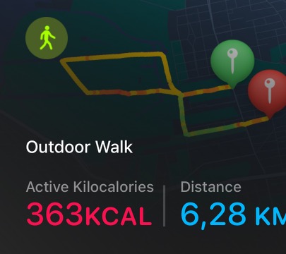
That’s the raw, uncompressed and uncropped image straight out of iOS 16’s Activity.app if you click the “Share” button. Low quality and cut off.
I feel like I’m going insane, something about the behavior of notifications on the lock screen has changed for me in iOS 16. It’s the same on the actual lock screen, but it’s much easier to screen record the notifications screen that you can pull down from anywhere.
I don’t see any notifications anymore unless I swipe up first. I have missed a ton of things in the last week because I’m not seeing the things on my lock screen anymore that I expect to be there. It’s giving me massive anxiety and I now obsessively perform ridiculous swiping down and up gesture dances all the time, just to be sure my phone isn’t hiding things from me.
To see your notifications in Notification Center, do any of the following:
[…]
On other screens: Swipe down from the top center. Then you can scroll up to see older notifications, if there are any.
This apparently already was the case ever since at least iOS 13 – and I never had any issues with it before the iOS 16 update. It should only affect “older notifications”, but how is that even defined? Based on time? Based on me theoretically already having been able to see it? Will a notification be marked as “old” if I accidentally glance at my phone from an angle where it can unlock upon receiving a notification, even if I don’t interact with it at all? Is the iPhone 14 Pro so much faster and better at FaceID that I now face (ha!) an issue I didn’t run into with the iPhone XS? Is there something weird going on due to the always-on screen where iOS now interprets any notification that comes in while the screen isn’t off (e.g. lying face down) as already seen? Am I experiencing some kind of bug? It certainly feels like one.
Look at the notifications in my video above – the top-most one is still showing “Now” for its timestamp. I triggered it seconds before recording the video, and I did not interact with the phone in-between at all. I didn’t see the notification on my lock screen when unlocking it, and the first thing I did afterwards was recording the video – if I hadn’t swiped up, I’d have no idea that there’s a new notification. (Same applies to the four minute old test notification.)
So much for reducing notification induced stress…
If only there was enough space to display the entire text. If only this was a first-class native experience and not like a web view with early 2000s era CSS problems.
Exclusive AT leak: iOS already includes foldable iPhone code!!!111 (I think this might be some kind of accessibility feature? Happened almost every time I took the new iPhone in/out of its case, maybe some combination of button triggers it – not sure why it would be useful, though. And no idea how to disable again other than locking and unlocking.)
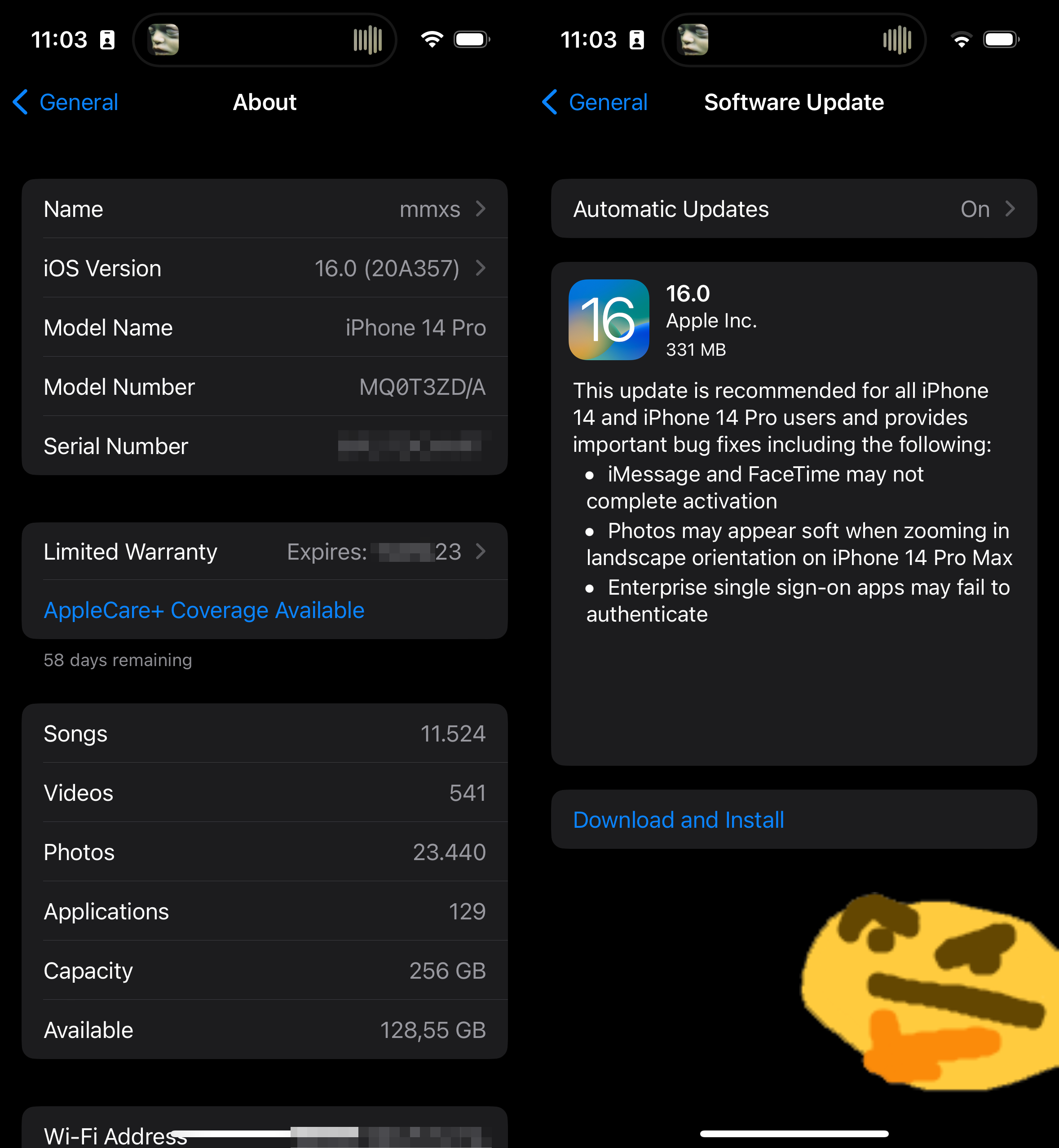
Guess I’ll upgrade from 16.0 to 16.0 then.
I usually try not to swear or be too harsh when writing here, because I work in tech myself and I know that mistakes happen, things sometimes unexpectedly go wrong, and behind this all there’s humans trying – usually – to do their best.
But I honestly don’t know what to say about this insanity without using foul language. Are you fucking kidding me? For fuck’s sake – no, not Messages would like to paste from Twitter, I would. And I did. I tapped the damn “Paste” button myself. What the hell is this ridiculous dialog supposed to achieve? I really hope this is a bug1 and not supposed to pop up. Either way, hard to find an excuse for something like this making it into the final release version of iOS 16.
According to the comments here, it might not be happening to everyone – though most of the people there don’t really understand the issue apparently. ↩︎
Even on the Dynamic Island you are not safe from encoding issues.