This suddenly showed up, maybe a Safari.app update gone wrong?
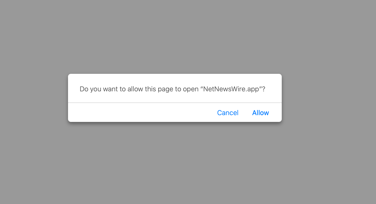
I gave up finding a way to disable this user hostile behavior of Safari when opening a link pointing to an RSS feed. If you don’t have an app installed it redirects you to the Mac App Store, if you have one installed your only choice is to open it in that one or “Cancel”.
If you just want to see the XML file or direct URL so you can add it to your feed reader that’s not running on your computer you’ll have to use curl or something else.
“But why are you not taking advantage of this useful feature?”
My RSS feeds are fetched and synchronized via a self-hosted Miniflux instance and so in my workflow it doesn’t make sense to subscribe to feeds in an RSS reader app running on my computer.
Update 16.02.2020: There’s a paid extension for Safari that extracts the feed URL from the page and adds it to your clipboard.
I really wish I could understand the thought process of designing UI like that. I swear, I’m not making this up. (To be fair, the UX is still a gazillion times better than having to call my dentist to make an appointment.)
Yeah and fuck you too, Google. Still baffling to me how this is not illegal. There is no recourse, no appeals process, nothing. Our machine learning doesn’t like you? Tough luck, no internet for you.
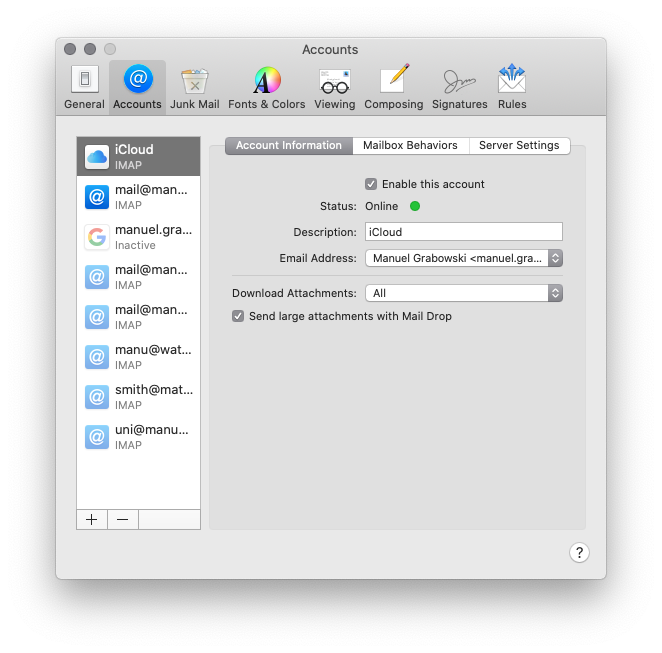
So I’m a bit of a domain addict and have quite a few email accounts on those domains. Some of them are similar. There is no way to increase the width of this list on the left side in the account settings for Mail on macOS. I have to click on the entries to find out from the details on the right side which entry is which account. Because from just the list, I can only choose between mail@man…, mail@man… and mail@man….
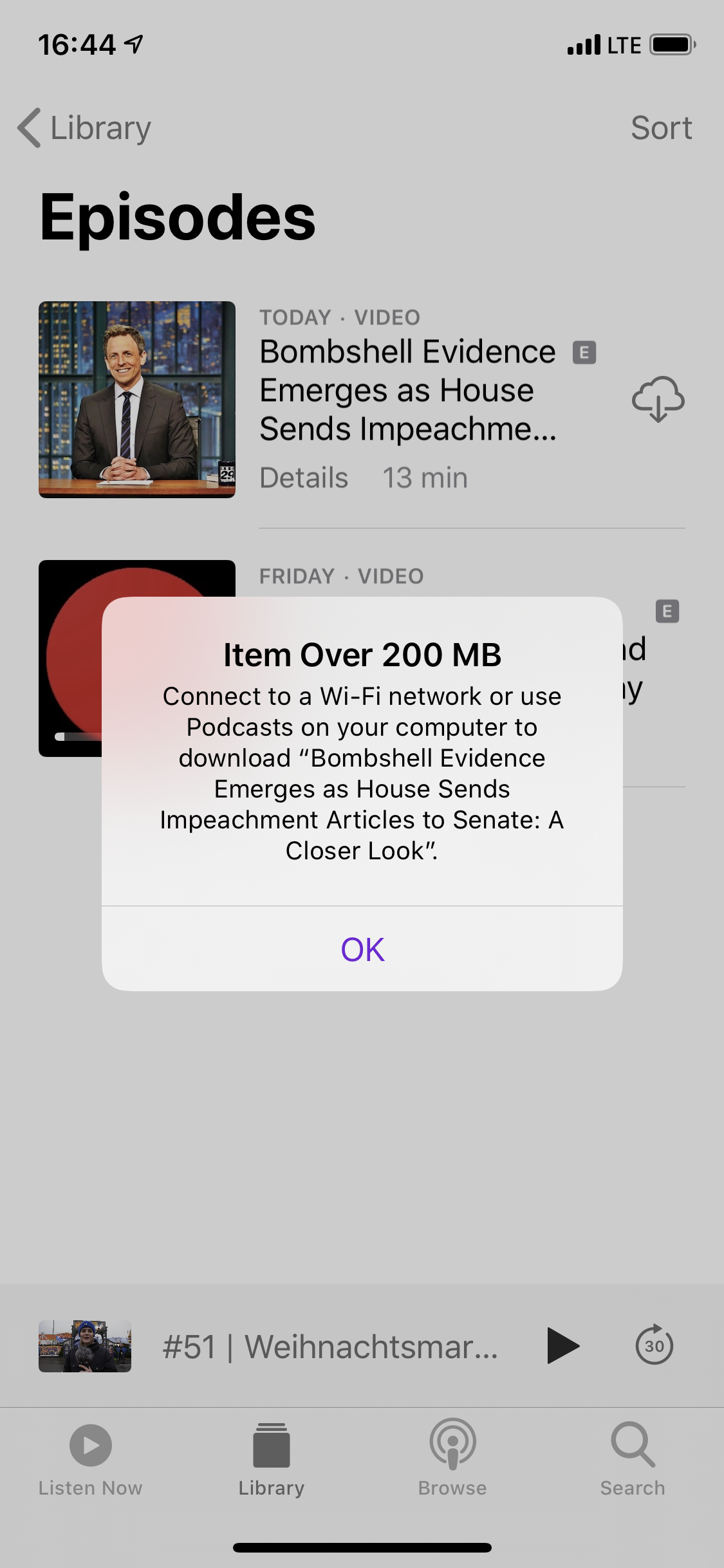
I realize I’m far from the first person to talk about this, but it personally affected me for the first time, so I want to rant about it. I know, most telcos still live in the 90s. And that’s why I disabled automatic downloads outside of a WiFi connection. But I actively tapped the download button. I specifically wanted to download it. Fair enough to warn me again – but how about telling me the actual size? Is it 3800 MB or 207 MB? The error message does not provide useful information, and neither does it allow me to overrule the limitation. Even digging through all kinds of settings I was unable to get around it. After some googling (I refused to believe that this is actually still a thing in 2020) it seems that this is intentional. My 1500 bucks “smart” phone is telling me what I can and can’t download over the mobile data connection. Needless to say, I streamed it instead and used up the entire 3800 MB or 207 MB anyway. Not without a few buffering breaks of course, which is the exact reason why I wanted to download it beforehand in the first place.
When I saw one of the latest posts from our fellow annoyees over at the grumpy website I bitterly chuckled. While the described navigation is quite annoying when using Apple Music, it is not even possible to go from a track to the artist when you use a local library. And it has been that way for a couple of iOS versions.
Tapping the artist name in Now Playing brings you to the album. Tapping the artist name in the album view brings you… nowhere. Neither context menu has an option to go to the artist. It’s mind-boggling, really. The company that built the iPod. I guess I should just be happy that tapping the entry in the artist list still goes to the artist view.

I mean… I know it’s hard to properly style content that has varying sizes. But come on, you’re fucking Google. And there is a ton of white space where that final zero could fit.
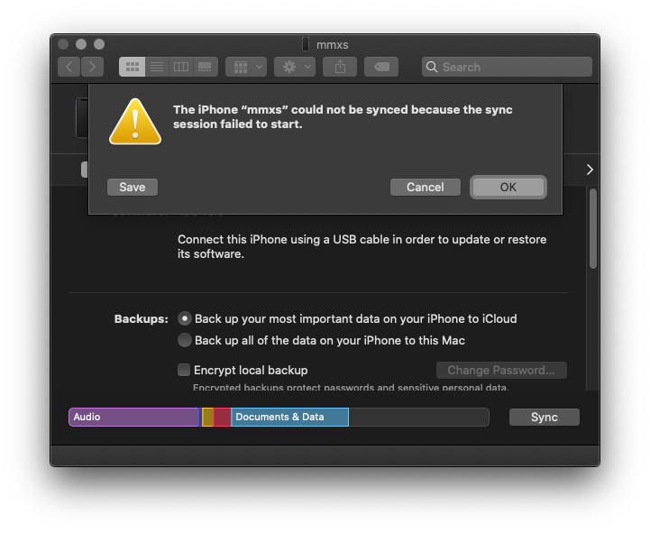
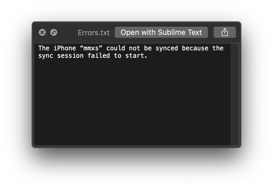
Wireless syncing is still a buggy mess now that Finder handles it. I guess making that experience as shitty as possible is a cool Apple Music growth hack. Anyways, I was a little annoyed that this dialog would not just show me the error log directly instead of forcing me to save it to a text file. But okay, let’s Save and see what it says. It’s not like I had high hopes for finding any helpful or actionable information in it, but the actual content was still surprisingly dumb:
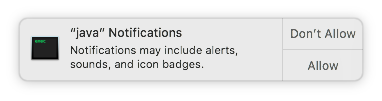
The best way of conditioning users to immediately accept the dialogs you throw at them is to expose them to useless alerts that come out of context on a daily basis.
In this case I’m updating a JetBrains product (which I, as a tech person know is based on Java). What about a normal person though? Could also be a random crypto miner that calls itself “java”.