
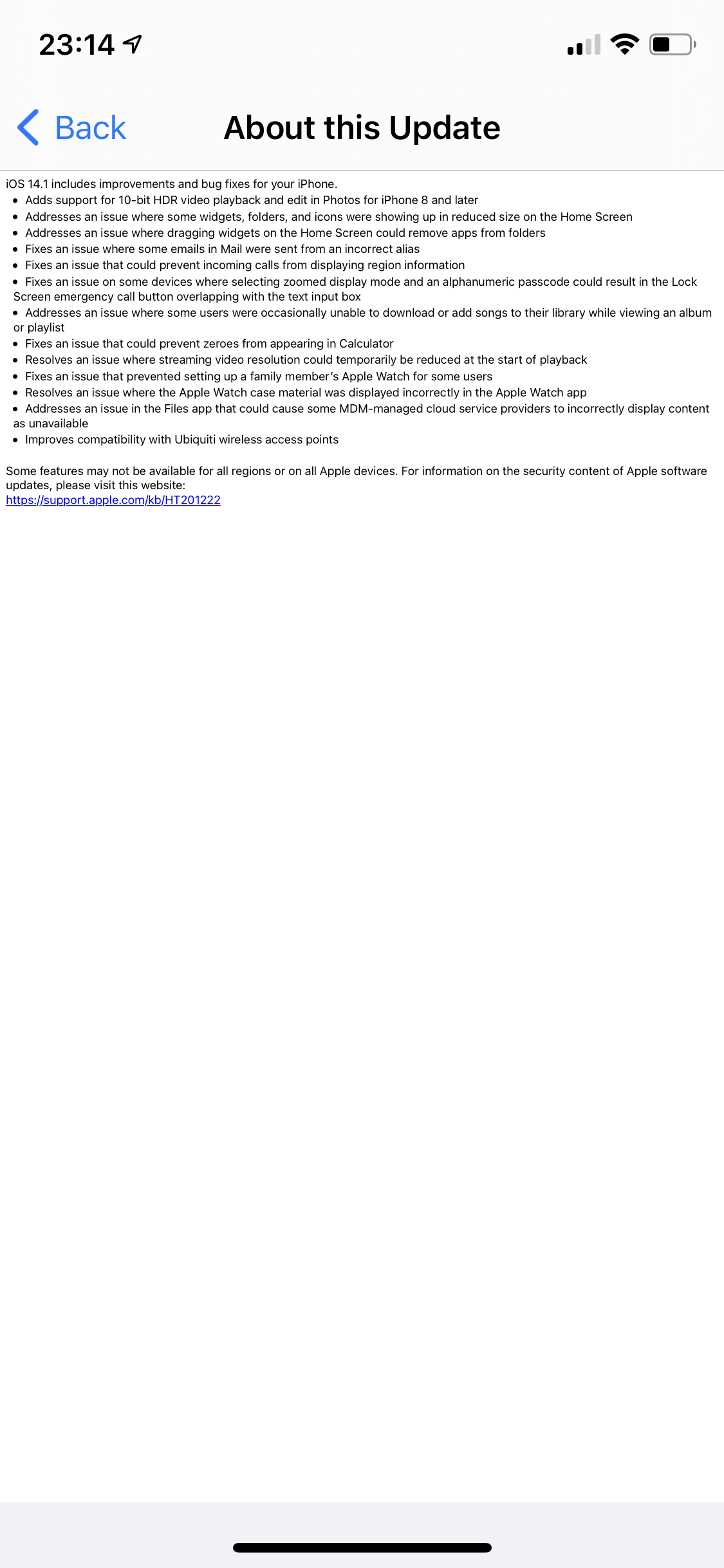
Will clicking this button turn the reminder on or is this the way an active reminder is shown?
Will clicking this button turn the reminder on or is this the way an active reminder is shown?

If you are trying to sound more personal and friendly don’t just assume all email addresses are in the firstname.lastname@example.com format.
I guess “Pausing the video when the user requests it” is a bit much to ask of a website for *checks notes* videos.
Truly the masters of accessibility.
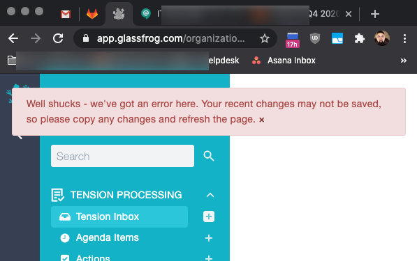
This message really isn’t all that helpful when you show it to me after removing everything from the page as soon as I click the submit button. There is nothing but whitespace left.
Is there a name for always manually copying longer texts into the clipboard before submitting them, just so things like that don’t ruin the day? Fear of submitting form?
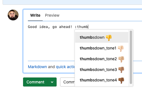
Something very mild compared to most things we post here. And there is solid reasoning behind it – alphabetic sorting. Still, it annoys me on an almost daily basis. Pretty much 100 percent of the time when I want to use a “thumbsup” or “thumbsdown” emoji in GitLab, what I want is the “thumbsup” – to give positive, encouraging feedback. But the default choice is the negative one, and I have to type the word “thumbs” plus the differentiating “u”. So basically I’m typing the entire emoji name, because the autocompleting list that is supposed to help me not having to type the entire word is rendered useless.
I’m not sure what a good solution could look like here. Sorting by usage frequency seems overly complex. Maybe an option to hide the (or select a default) skin tone variations in the list, so using Arrow-Down would quickly select “thumbsup”. Or removing the negative reactions, either from autocompletion or altogether? The “old man yelling at cloud” in me says that negative feedback should always use words, but that doesn’t mean there are no valid use cases for the “thumbsdown” emoji. Maybe change them to “thumbs_up” and “thumbs_down”, and implement fuzzy autocompletion on word beginnings, so that I could just type “:tup” and be done with it. At least that would still be quicker than using the native macOS dialog via Ctrl+Cmd+Space. Luckily I’m not alone in being annoyed by this, and there is plenty of ideas in GitLab issues already.
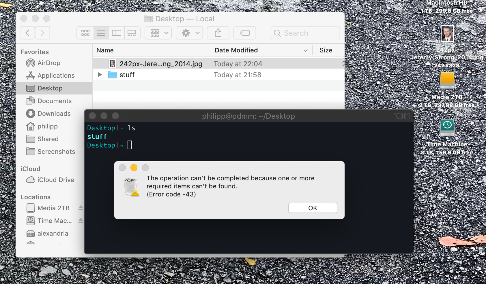
The previous post showed how to make the Finder show files, this one shows how to … not delete them? The file doesn’t exist on disk any more but Finder doesn’t know about it. Error -43, what else?
That’s one way to keep the Desktop clean and organized. Catalina decided to only refresh the view once I kill the Finder. This didn’t go away until I rebooted.
Hey Siri, show me the worst way to implement pagination!
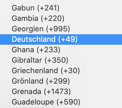
Country selection dropdowns are the USB ports of UI components.