Less is more, or something like that.
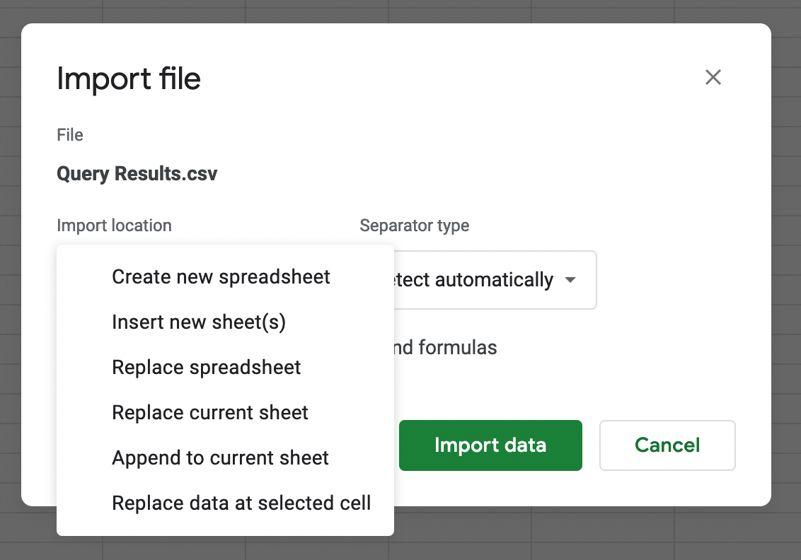
The daily game of “will I overwrite the whole spreadsheet or just add a new tab to the sheet”.
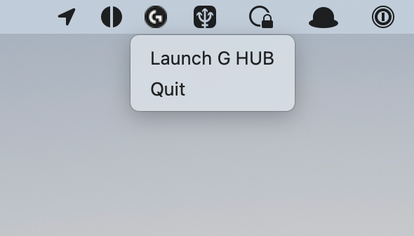
Now if only there would be space to add useful options. Maybe the main functionality of the app: “turn light on/off”?
Someone’s getting paid by app openings.
Bonus points for the pixelated app icon in 2022. It’s only been 10 years since the introduction of retina screens on Macs though.
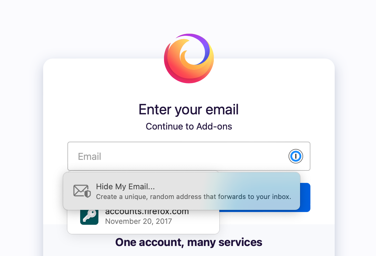
The hottest fight in browser land right now is who can get the most screen estate on password input fields.
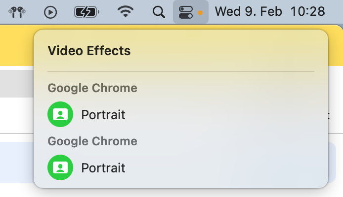
Unsure what this is supposed to tell me.
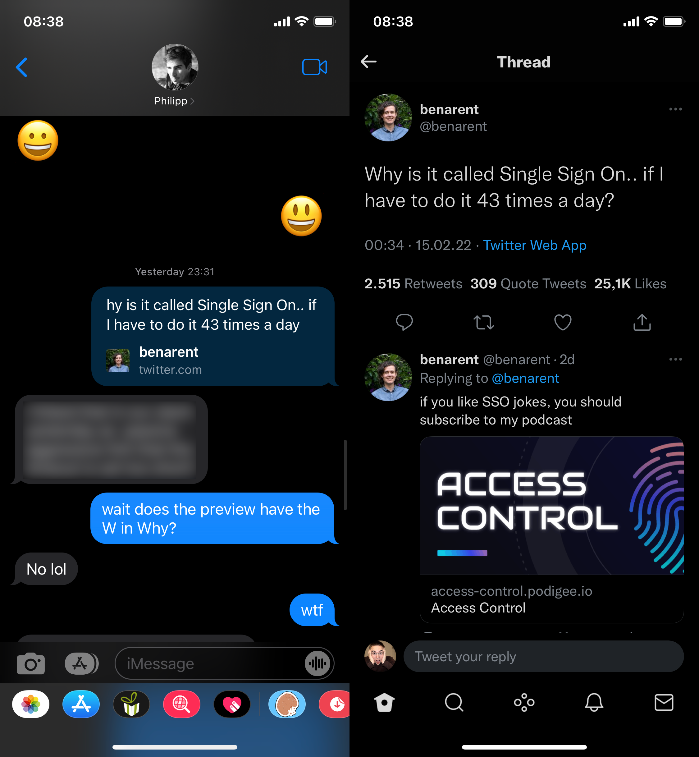
t just works!
(This started happening at some time between 7pm and 11pm CET on Feb 17th, since then it has affected every new Twitter preview I see in iMessage, on both iOS and macOS, and it always shows for both sides of the conversation.)
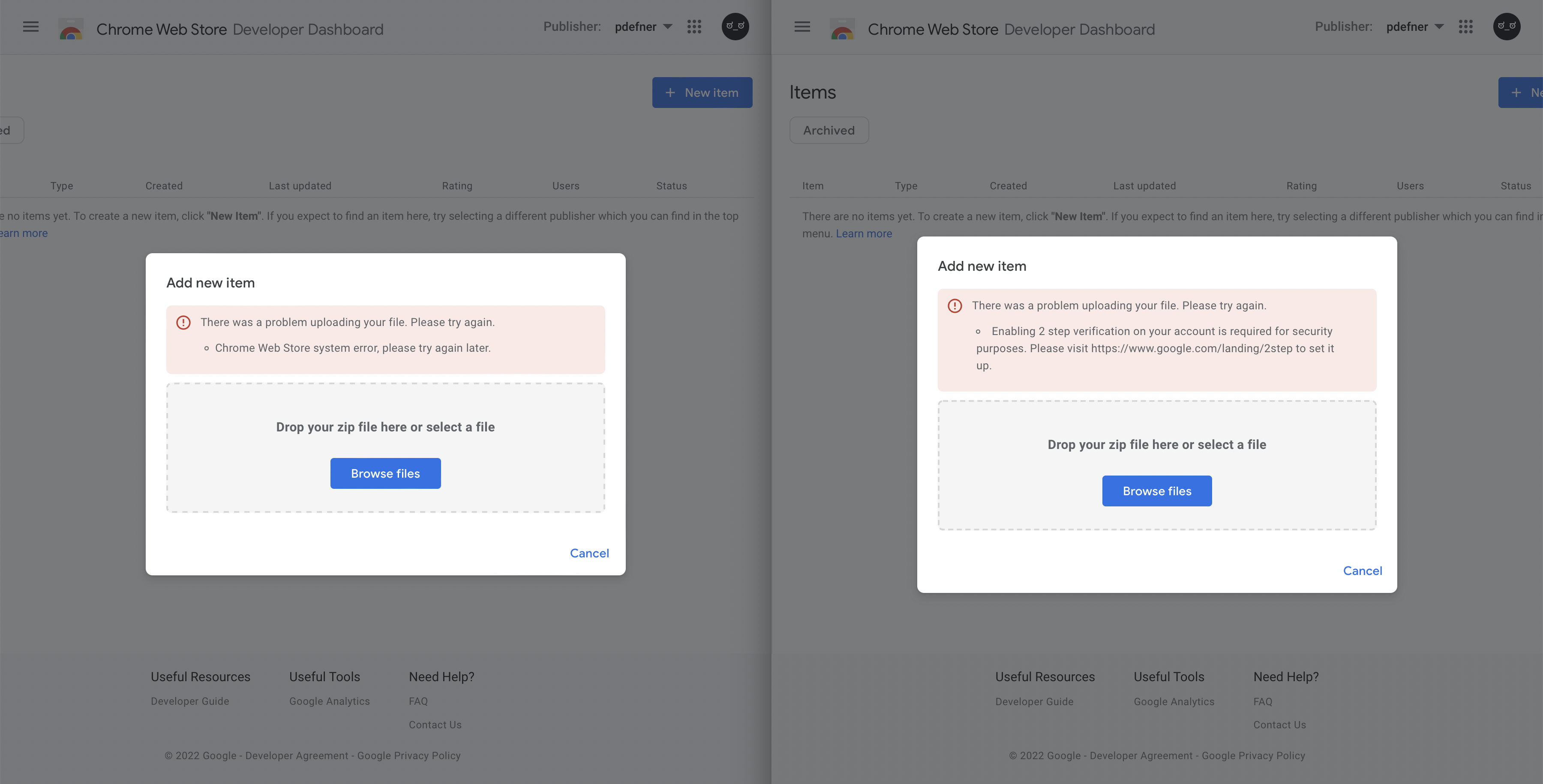
When submitting a Chrome extension for review I got this error message that didn’t really tell me anything:
Chrome Web Store system error, please try again later
I had a hunch that Google is probably doing Google things and it only works properly in Chrome. Tried it there and you’ll see a proper error message.
Thanks Google for wasting my time!
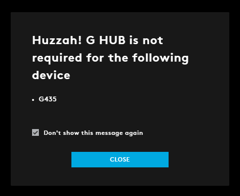
What the heck is this message supposed to tell me?
I recently got myself a G435 headphones from Logitech. For years now I’ve also been using both a wireless mouse and keyboard from Logitech, both of which “require” the G HUB software. For that reason, this software is starting automatically with the system and is always running.
This dialog popped up randomly today, which is several days after I had first connected the new headphones to my computer. I used them with that computer on multiple different days between first connecting them and this dialog popping up, and the computer was rebooted multiple times during that time (it’s my gaming PC, not the Mac). The timing of this message makes no sense, why not show it right after first connecting the new device?
But more importantly: Even if the timing wasn’t so weird, I repeat – what the heck is this message supposed to tell me? Do they hate their own software and are so happy this device doesn’t need it that they just had to tell me? “Huzzah!”? Did you mean to write “Hey there, you might be looking for settings regarding your new G435 headset in the place you’re used to manage all your Logitech gear. For this device there currently are no settings available, so we don’t show it here.”? Don’t you have technical writers?
The headset itself is pretty good. All my other Logitech gear is good. Even the G HUB isn’t the worst software on that gaming PC by a long shot. And for the first few days, the new headset just worked. I connected it and that was it. It did it’s job, I didn’t have to enter my life story into some new account that’s forced on me, didn’t have to install drivers or a kernel extension. How things should be. And then they fuck it up with this stupid dialog. Not a big deal, but I just hate that these kinds of paper-cuts are so normalized these days.
It has been bugging me for quite some time now that Twitter seems to include likes and retweets from profiles I’m not allowed to see in their counts. Sometimes it’s nice to check out who interacted with something to make connections.
I know, Twitter wants to be a glorified feed reader dumpster these days instead of making connections1, but come on. Use the same SELECT statement for counting as for listing.
-
I still have not forgiven them for #fixreplies, and I never will. ↩︎
Oh, you wanna click that button? – I don’t think so, mate!
Mind-boggling how hard of a concept it seems to be that you should not just move the action target away exactly when the user wants to initiate it. This is Steam in 2022. Even if the action was the same in the end (it’s not, you’re loading the details page instead of playing/adding to library right away) this is still so irritating when it happens.