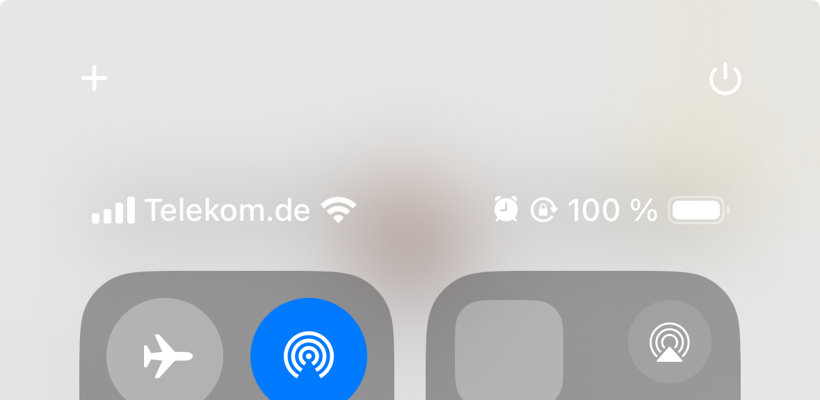
Could the contrast be any lower? The “+” icon is unfortunately also positioned in a way that swiping away the control center makes it very easy to trigger by accident.

Could the contrast be any lower? The “+” icon is unfortunately also positioned in a way that swiping away the control center makes it very easy to trigger by accident.