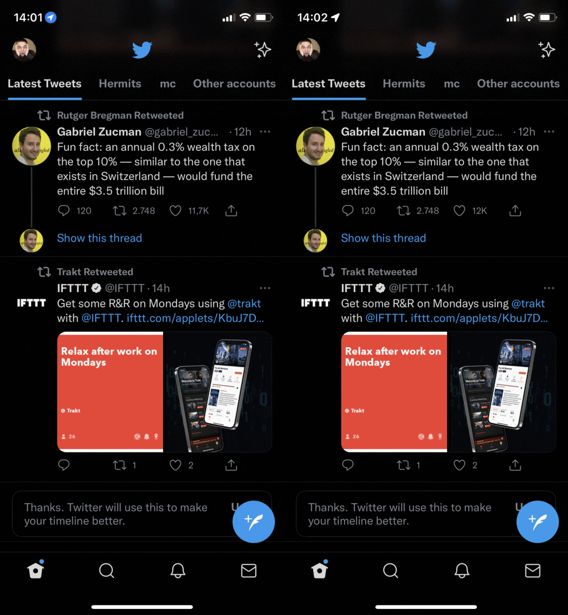
Another thing I really, really dislike in iOS15 is the new “location usage indicator” next to the clock display. It’s always there, but most of the time it’s just a hollow outline. When you switch to an app that is requesting your current location information, the indicator lights up in blue.
The gif above can’t properly capture just how much this draws your eye towards it. I’m sure I’ll get numb to it soon enough, but right now I always have a kind of “Oh, new notification?” impulse-like reaction before realizing that it’s just this dumb thing lighting up again.
And what is it good for? No explanation, it’s just there. You can’t even tap it. You just have to know (and in fact I have no idea if my explanation above is correct, just my best guess). It’s not even in the same style as the location usage indicators that are explained at the bottom of the Location Services page in the Privacy settings. How exactly does that help consumers make more informed choices about their privacy?
To me, this new indicator is about as useful as a cookie banner. Both inform me about something I’m basically aware of anyway, and neither really give me more choice.