System Settings on macOS is still an absolute fever dream
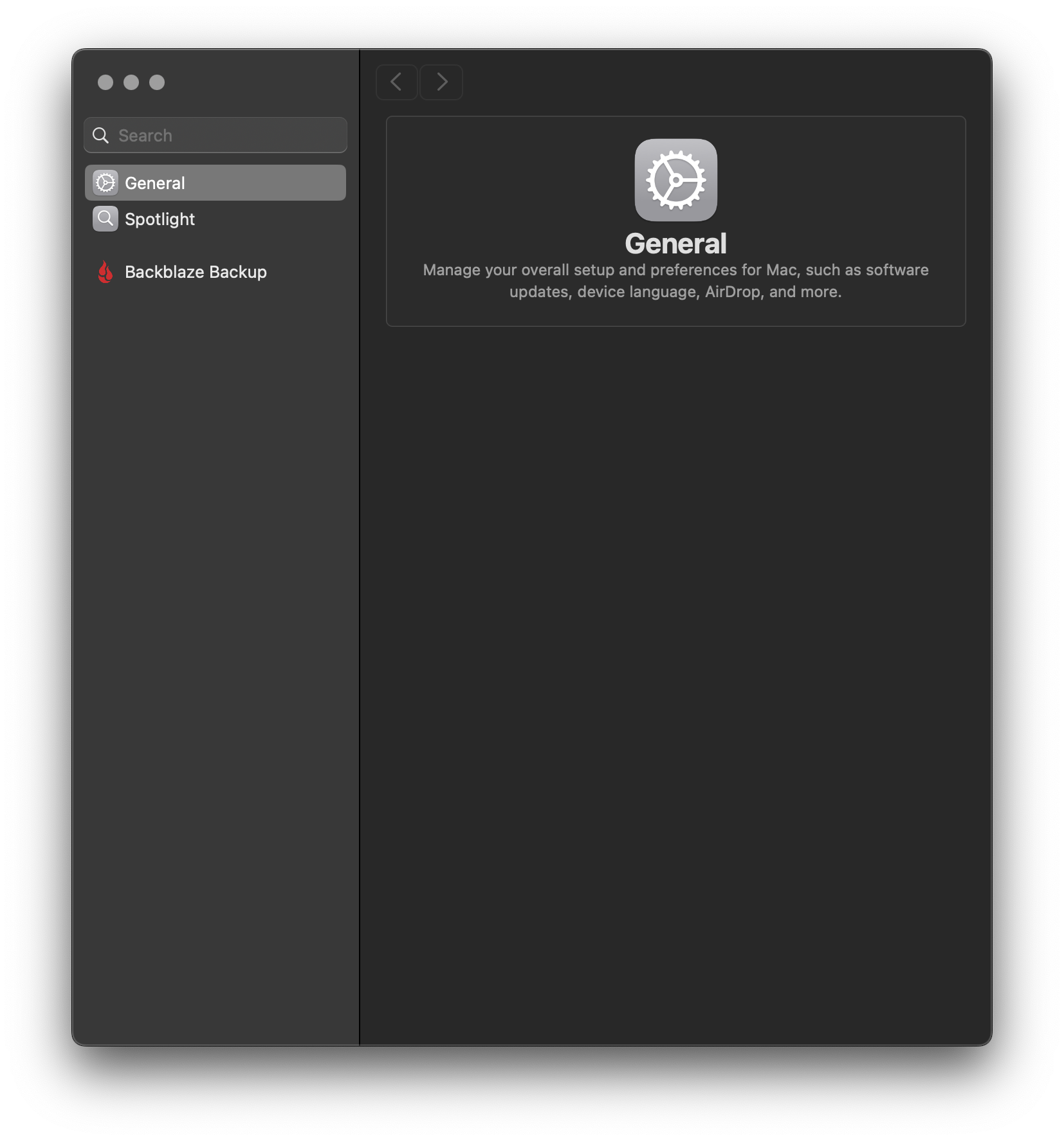
All these screenshots are a couple of weeks old – I took them while my personal laptop was still holding out on 15.8, when reproducing something I had encountered on my work machine which had already been forced into macOS 26’ ugliness.
The header photo above is a bonus bug which I only encountered while trying to reproduce the actual problem I wanted to highlight here. I can’t say that I encountered this again since, but what a bizarre stroke of “luck” that exactly when I specifically needed to interact with System Settings to verify if some broken behavior was already present in 15.8, it would greet me with this very empty state. Searching for anything didn’t yield results, clicking on Spotlight or Backblaze didn’t do anything. Quitting the app notably did not fix it, I had to reboot.
What I actually wanted to show was this, though:
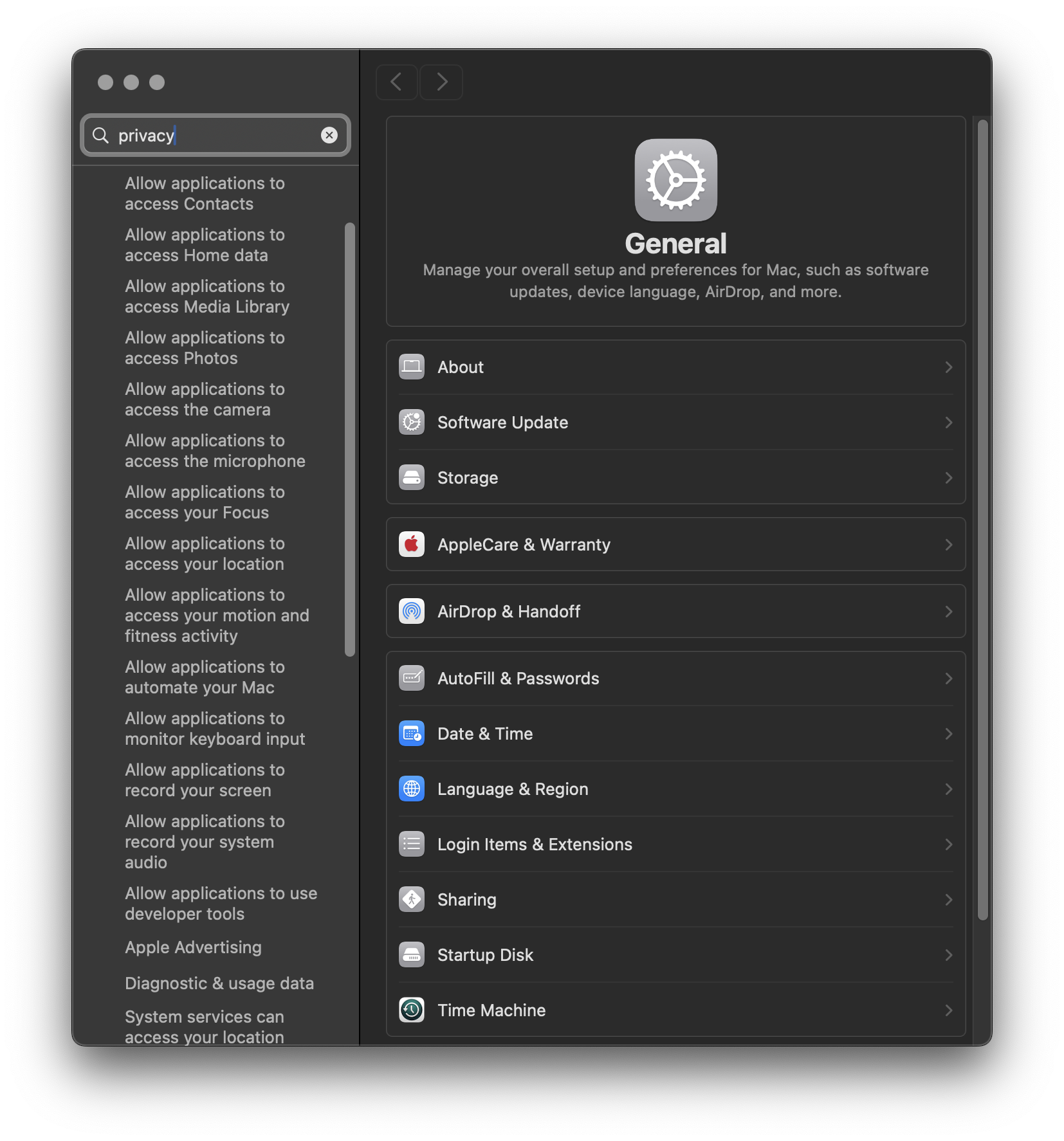
Despite normal macOS usage now requiring a trip into Privacy & Security on a regular basis, I still find the new UI so disorienting that I usually resort to searching for what I need. When I did so this time, I thought something must be broken – none of these results mention “privacy” at all?!
After a couple of very confused seconds I realized what was going on – the scroll position of the search results sidebar was incorrect. I was able to reproduce this outcome consistently, both on 15.8 (might still have been 15.7?) and whatever exact version of 26 my work machine was on. Scrolling up manually solves the mystery:
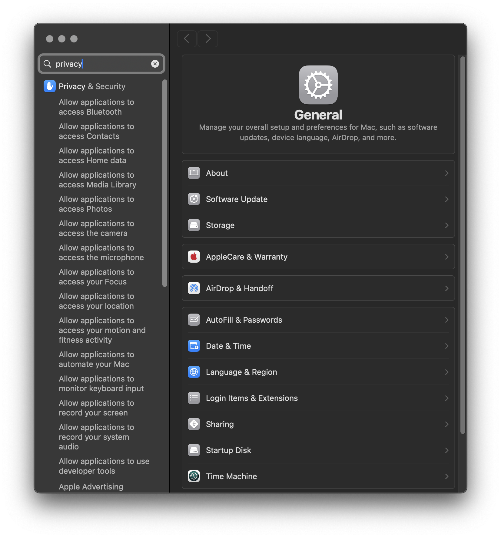
Now, just to be clear – this is still terrible without the scroll position bug. Why does it list every single subsection of the Privacy & Security section? It is not matching on any text in their name or content – let’s take a look at the very first subsection, allowing Bluetooth access:
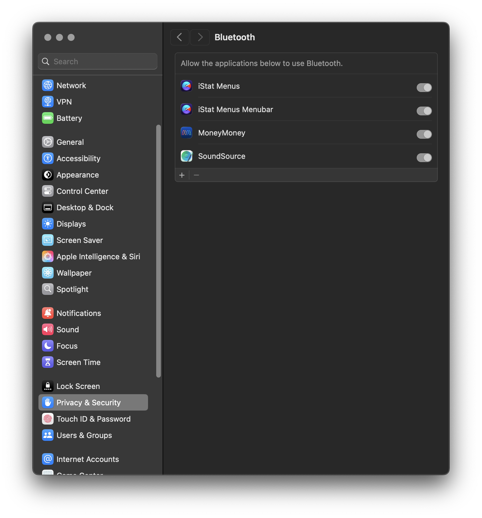
The word “privacy” is nowhere to be seen.
Aside from the awful waste of space, this also lacks a sense of orientation. Nothing immediately tells me that we’re in a subsection of Privacy & Security. The only indication is the selected item in the left sidebar. Why is there no breadcrumb in the title, for example? The < > buttons on top don’t navigate through a hierarchy either, they navigate through history. Nothing inherently wrong with that, but the fact that you can go to a subsection a) through the hierarchy (i.e. you first click on Privacy & Security yourself, then on Bluetooth), or b) directly through search can result in history entries that make those buttons feel like they don’t follow a consistent pattern.
(This does look better in 27.0.1 – the subsection names are now the primary result text, and Privacy & Security is shown as secondary text with each one, so it is clearer why the results are what they are.)